
Lemonade: Letters to Art Micro Review
Ricky Larry, 2022.
Happy Days.
Nan, Julie, Video Ezy, and Pizza Hut are all on speed dial in Ricky Larry’s solo: Happy Days.
With two moulded pink window frames, Larry invites the audience into his childhood memories. Replica 90s household objects and products are brought back to life through Larry’s DIY sculptures and installations. Via his personal narratives, he opens space for us to make connections to our own childhoods. Larry sends my nostalgia into overdrive as I take in objects so familiar to my youth in suburban Australia. The pink and green tennis balls, Nintendo Gameboys, hundreds and thousands fairy bread, and melting cornetto all transport me to those happy hours spent after school, killing time—before we knew how precious that time really was.
Video is new to his practice. Rage Days shows the artist embodying multiple personas to the tune of Land Down Under. This invigorates his objects, injecting energy and life into otherwise mundane suburban moments. In a laid-back larrikin style, the artist conjures Aussie truisms. Endearing, comforting, and all too familiar, Happy Days was well worth the trip down memory lane.
Thoughts from Ally McKay, artist, writer, and educator.
Ricky Larry: Happy Days
Wreckers Artspace
15–29 October 2022
1-5. Ricky Larry, Happy Days, Installation shots, Wreckers Artspace, Photographs: Charlie Hillhouse
IDs: Ceramic fired and painted Gameboys in blue, yellow, green, red and pink lean against the wall on a shelf
Ceramic fired and painted sculpture of Ajax spray and wipe bottle sits above a cut mango sculpture, both are displayed on small wall shelves
A white gallery wall, photographed on an angle, shows the Gameboy sculptures to the right; on the left is a haphazard display of green tennis ball sculptures, each on their own small wall shelf
Ceramic letters with hundreds and thousands spell the word HUNDREDS on a white wall above a light blue plaster-bandaged plastic chair
A massive red SAMBOY Chip packet soft sculpture is slouched against central metal pole in foreground, tennis ball and Gameboy sculptures are in the background

Lemonade:
Letters to Art Micro Review
Sunshine Coast Art Prize, 2022.
Caloundra Regional Gallery.
I’m counting myself lucky that I’m not tasked with judging the winner of this year’s Sunshine Coast Art Prize. I like Richard Bell’s idea of throwing a dart at a list of names, leaving it to chance, because the diversity and calibre of work makes it near impossible to choose a favourite.
Rachael Haynes’ delicate yet defiant watercolours, “Climate Targets,” caught my attention, protesting climate inaction through the configuration of a paper quilt. Her circular target shape bounces across to Marcel Cousins’ acrylic, “Polyethylene Terephthalate Fibres Under Tension,” which addresses machine-generated narratives via a series of outward-bound colourful rings that distort and defy perception. Another work that adopts an out-of-focus technique, blending quilting shapes and the bright colours of Crimson Rosellas and King Parrots, is Susan Knight’s “Birdsong eight”. Many artists reference the effects of Covid-19; none more than Mark Forbes’ “Boy,” which captures his son’s lockdown frustration, flying coloured paper planes into the corner of a room.
The exhibition is beautifully curated. Each work resonates in its own space while formal connections of colour, shape and size create a sense of cohesion. Reading the walls as if they were pages of a book, each piece reveals common themes of reflection, observation, and environmental concern. The Sunshine Coast Art Prize brings together a strong collection of finalists that reward being seen.
Ally McKay is a Brisbane based artist, writer and arts educator.
Sunshine Coast Art Prize, Caloundra Regional Gallery, 26 August–16 October 2022
1: Rachael Haynes, Climate Targets (Quilt), 2021, ink on watercolour paper, 155 x 120cm
ID: A grid of 9 watercolour painted targets with words of protest painted within each target.

Lemonade: Letters to Art Micro Review
Sebastian Moody, 2022.
Opinion Fatigue.
I am still decrypting the codified arrangements in Sebastian Moody’s latest body of work, Opinion Fatigue at Onespace Gallery. Do empty quotation marks “ ” signify silence? Does the shape of the less than chevron < suggest parted lips when the word “kiss” lingers below?
Plugged into the matrix that Moody has presented, I find myself taking in concrete poetry at its best, considering shapes and angles of punctuation in new ways. A sporadic word hints at yet doesn’t reveal its secret to the viewer. It’s almost as if the artist is withholding a formula, which keeps the viewer guessing from one piece to the next. I dig deeper to explore the shape and momentum of each painted word-scape. Some works spin into blackhole voids whilst others remind me of time spent vertically scrolling through cyberspace. Moody carefully discloses clues on the floor, encouraging the audience to find commas, hashtags, and brackets at their feet, transforming the space into a capsule of redacted conversation.
A further key hovers in his exhibition title: overexposed to endless opinions generates the sense of overwhelm Moody is getting at. There’s a blurred line between sense and nonsense in this body of work that becomes a dot-to-dot constellation of thoughts across walls and floor. Through this work, Moody invites a meditative reflection on information consumption. He playfully challenges us to reconsider the visual nature of communication and gently nudges us to examine how we can make sense of it all.
Thoughts from Ally McKay, artist, writer and educator.
Sebastian Moody, Opinion Fatigue, 22 July–27 August 2022, Onespace Gallery.
1 and 4. Sebastian Moody, Opinion Fatigue (rhyme smoke), 2022, Acrylic on marine plywood, 100 x 100 cm. Photo Louis Lim. Courtesy of Onespace Gallery.
ID: A dark painted square with a variety of small white typographical syntax and punctuation arranged sporadically alongside the words rhyme smoke, the and kiss. .
2-3. Installation images: Photo: Louis Lim. Courtesy of the artist and Onespace Gallery.
IDs: Monochrome paintings in blue, purple, brown, grey and black fill white gallery walls.
Lemonade: Letters to Art Micro Review
Rachel North, 2022
Texture and Colour: An evocation of lived experiences of the landscape.
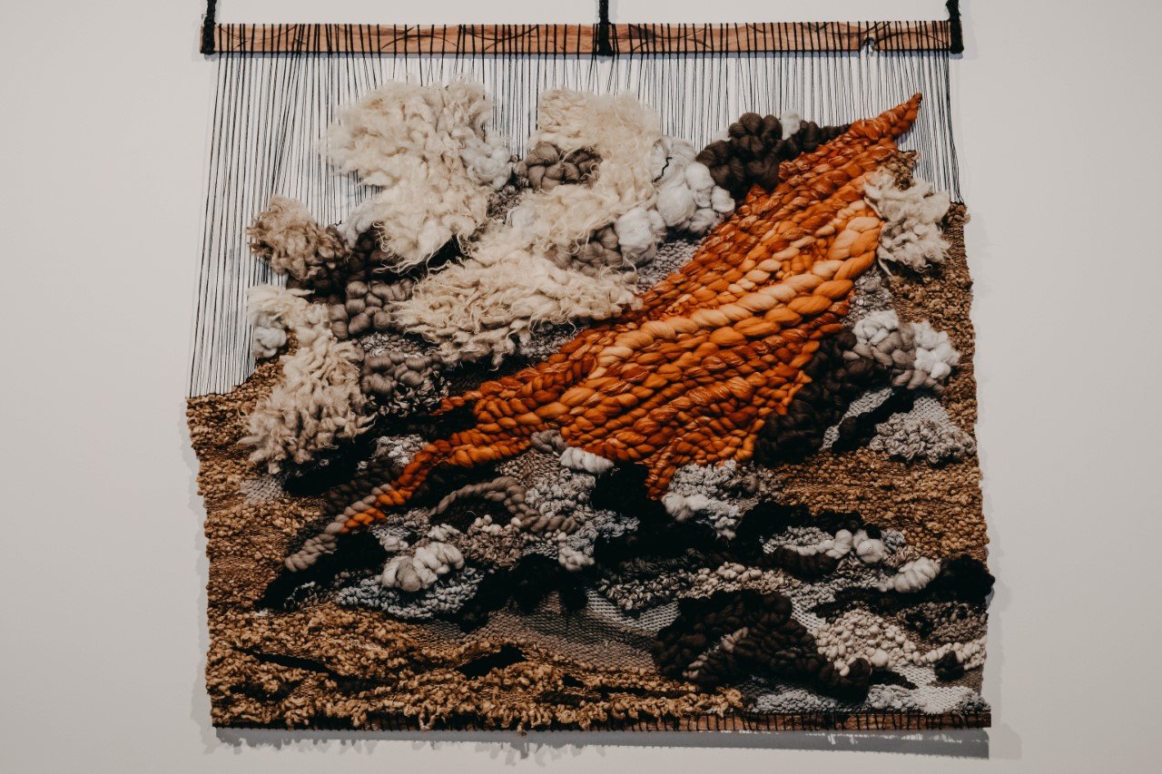
I love the feel of wool. There is something undoubtedly Australian about seeing rams’ fleece and wanting to feel the warmth and texture of it. The works in Rachel North’s exhibition manipulate natural materials with subtlety and command in the beautiful heritage-listed space of the Ipswich Community Gallery. Echoes of colours, rich and raw, reverberate across walls and weave memories of time spent on the land. I take in the delicate, flood-stained silks and find the tucked eucalyptus leaf within the weft of a woven wall hanging. I observe the earth in all red dirt sunburn and fire-stricken ash. There is a sense of strength and harmony tied together through clay, dirt and thread, which both celebrate and remember the land in equal parts.
Thoughts from Ally McKay, artist, writer and educator
Rachel North, Texture and Colour: An evocation of lived experiences of the landscape, Ipswich Community Gallery, 30 June–10 July 10 2022
1. Rachel North, Black Summer, 2022, Handwoven wall piece using natural, naturally dyed and reclaimed wool, silk and cotton fibres hanging on saw-burnt, hardwood offcuts from the framing industry, 155 x 160 cm
ID: A large-scale, woven wall hanging, with an orange focal point and blue, brown and white yarn creates a landscape formation
2. Rachel North, installation view
Small vessels are arranged on white plinths amongst a dark, scattered dirt
3. Installation view
ID: In the middle of a gallery sit the three former plinths, weavings in natural colours hang on the walls
4. Detail
ID: A part-woven, part-ceramic vessel filled with dry sprigs sits on a crumpled natural sheet

Bench Space, 2019
A warm mustard light blankets the kitchen. Empty wine glasses worry by the sink. We know these objects; they sit as instruments of our underlying habits. We pile, place, and forget. Sunday roast pumpkin and wine. A cheese escaping its wooden board, upon a tea towel forgot. Did we cut the cake in half to share? Or just to nibble at, morsel for morsel? There are stories in these fragments. We are asked to contemplate the life within these compositions, and take away healthy doses of comfort in their familiarity. As paint finds its way delicately around edges, Scales invites us to view these objects with a renewed sensibility and awareness. We gain a sense that these humble but honest objects say more about us than we know.
- Ally McKay

Robert Andrew
Our Mutable Histories, 2017
Installation view, Robert Andrew, Our mutable histories, Photograph Carl Warner
Entering into Robert Andrew’s exhibition “Our mutable histories” at the Museum of Brisbane, I am immediately confronted with a warping mechanical sound. This is coming from Andrew’s most recent work, “Data Stratification.”
Combining the sleek aesthetic of modern technology with natural materials, Andrew has developed a number of kinetic installations which speak of his Indigenous Australian history. Having descended from the Yawuru people of the Rubibi (Broome) area West Kimberley in Western Australia, Andrew generates work which questions the broader context of European colonisation in a way which is commanding and yet somewhat subtle.
Commissioned and meticulously built for the space, the work is comprised of a small TV screen displaying a definition of a Yawuru word with its English translation. I read the word “Buru Jara” with its English translation “Me and Your Land, World”.
My eyes can’t help but feel transfixed by the mechanical component of the work which moves hypnotically like an ouija board. The machine works within a Cartesian system relying on the text displayed on screen to generate a programmed movement responsible for the puppet mastery of materials.
Each string in the mechanical grid threads up along the ceiling to correlate with four rows of natural materials. The materials consist of small irregular grey rock; shards of mother of pearl tied in a tight bunch; rigid tile shaped rocks rubbed with ochres and natural pigments; and small chunks of charcoal branches dipped in a red ochre.
I am taken with the slow movements of the materials. I watch the strings draw and ease out tension which orchestrates an ever-changing choreographed dance, layering shadows and shapes in a way which is completely captivating.
I sit and contemplate Andrew’s selection of materials and I take in this concept of Buru Jara.
The use of text and language plays an important role within Andrew’s practice as a tool for critiquing colonisation. Through this work, Andrew is educating the audience on a vocabulary that most Australian’s are not aware of. By using text within his art practice, Andrew reclaims a medium which has dominated cross cultural interaction within the process of colonisation and brings to light the significance of Indigenous language by acknowledging words that have become lost in their English translations.
What gives this work its strength is its ability to communicate the richness and connection that is lacking in text through the authority and communicative dimension of materials. Instead of show casing these objects in a traditional glass case museum context, Andrew gives these objects the performative power to tell their own history, responding to the coded movement of each Indigenous phrase or word.
This shift in authority speaks heavily to past misrepresentation of Indigenous history within Museum culture. Bordering on an institutional critique, Andrew presents these objects from an Indigenous perspective. Through the hypnotic and gradual movement, Andrew provides the audience with space to contemplate the significance and history of these materials belonging to a culture rich in a connection to place and land.
It should also be noted the striking juxtaposition of combining traditional and earthly materials with the modernity of 21st Century technology. Andrew utilises this combination of old and new in relation to his own mixed heritage, generating a new way in which to approach cross cultural connection.
This is also evident on the far wall, another sound spits and spatters like a sprinkler starting up, rapidly delivering a message in a morse code like fashion. This work, “Ground Up”, is another mechanical installation which sees large white panels covered in chalk beginning to reveal their secrets.
Andrew has designed this work to play upon the tension of revealed and concealed histories. Timing on a palmisphet system, the machine squirts small sprays of water which in turn, wet the chalk background and reveal text written in natural ochres.
The machine appears to pick a spot at random, changing from high to low and only reveals a few small splotches at a time. Each sprayed section mimics the effect of wood weevils, dribbling and scribbling into the background.
At my time of viewing, only a few letters are revealed and I imagine being able to read more as time progresses, adding incentive to come back and experience this work again.
The tension between revealing and concealing weaves through Andrew’s body of work as a crucial process and conceptual concern most effectively achieved through this kinetic process. The work also relies on time as a key element to its durational aspect, slowly introducing the audience to a seriousness at the core of Andrew’s practice.
The last installation, “White Wash Over The Burn”, is a static sculptural assemblage on the wall. This piece stands to anchor the movement of the kinetic installations, reiterating the personal connection Andrew has to investigating his own cultural identity.
The use of his own fence palings conjures up the great Australian dream to own a house. Andrew contrasts this aspirational concept by burning words exchanged between the artist and his grandmother into the white washed palings.
The patina reflects layers of history revealing the wooden origins of the fence, kindling thoughts of the land and connections to place. Through the process of burning, Andrew makes us think about our past and the pain of genocide, displacement and disregard experienced as part of our colonial history.
This piece particularly echoes the silenced and white washed history that is only just beginning to be heard and acknowledged. The quiet authority of the exhibition reflects within the title “Our Mutable Histories” as Andrew challenges through the communicative power of materials, mechanical revealing processes and text, the story of our collective Australian and personal histories.
References:
Museum Of Brisbane, 2017. Robert Andrew: Our mutable histories, accessed 21/03/2017
https://www.museumofbrisbane.com.au/whats-on/robert-andrew-our-mutable-histories/
Robert Andrew, 2015. Recalibrating Country, accessed 20/03/2017
http://www.robotandrew.com/reviews/recalibrating-country/

Michael Lindeman
2016
Michael Lindeman is a Sydney based artist whose practice critically challenges and reflects on the commodification of art. Completing a Bachelor of Fine Arts with Honours (1998) and Masters of Fine Arts (2004) at the College of Fine Art, New South Wales; Lindeman has gained national acclaim from his witty use of text and conceptually driven processes. Lindeman has exhibited both internationally and nationally, winning the Sulman Prize (Art Gallery of New South Wales) in 2010 and a finalist in the Archibald Prize, 2011.
Whilst keeping an open ended practice, the artist is known for his use of banal subject matter such as painted post it notes, handwritten letters and appropriated classified advertisements. Characterised by a hard edged aesthetic, Lindeman has spent many years with stencils and air brush painting to perfect a clean cut effect which appears to have come straight off the press. He uses these familiar formats from everyday advertising and media as a kind of institutional critique, elevating the status of the discarded and mass produced to be worthy of a fine art context through the medium of painting.
Lindeman challenges the role of art by recreating classified advertisements selling his art in a two dimensional style which mimics the writing and printing process. In doing this, he relies on humour and the familiar language of advertising to create text and imagery that challenges the viewer to reconsider the cultural value and meaning of art.
The work, Two Magnificent Oil Paintings, is an example of such critique as the text insinuates that Lindeman is selling two works of art (a Queensland tropical setting and a classical bush landscape), which are both subjects regularly consumed by the general public. Lindeman goes on to list a price ($30 neg.) for each painting to be sold separately, providing a suburb and contact phone number, painted over a flat cool grey swatch background.
There is almost an absurdity to the concise and blunt nature in which Lindeman has taken on the role of a salesman. This is also an aspect which gives the work its sense of deadpan humour through his use of limited characters in the standard newspaper advertisement format. The audience is thus given an element of creative freedom to imagine the type of paintings Lindeman is referencing, whether they actually exist or not.
By appropriating the Australian trading post, a document that is widely accessed by the general public, Lindeman taps into questions on general conceptions and expectations of art. Two Magnificent Oil Paintings implies that for art to be saleable it must be a landscape oil painting to be worthy of commercial value. Lindeman is pointing out that perhaps the public want art to decorate their walls that won’t cost them an arm and a leg. John MacDonald (2011), writes in reference to Lindeman’s work that it “provides a timely reminder of the way the vast majority of the population approach the subject of art.”
There is something undeniably Australian about these works as reflections of contemporary culture which carry an underlying theme of social concern. Part of this concern exposes questions of class and taste as he changes the context of the commonplace advertisement to be scrutinized by an educated audience. This leads the art world to confront the role of art in society and further question the role commodification of art has to play.
Courtney Kidd (2012), acknowledges the irony in Lindeman’s process as his “conceptual practice hinges on a critique of art as a commodity and his being a willing participant in this critique.” Lindeman hypocritically contributes to the consumer cycle by creating works which are in turn sold, adding another conceptual layer to his critique.
Reference List
Art Gallery of New South Wales 2012, Michael Lindeman, viewed 21 March 2016.
http://www.artgallery.nsw.gov.au/prizes/wynne/2012/29196/
Kidd, Courtney 2012, Michael Lindeman's Next Offer, Australian Art Collector, viewed 20 March 2016.
http://www.artcollector.net.au/MichaelLindemanNextOffer
McDonald, John 2011, Struggling Artists, viewed 20 March 2016.
http://www.sullivanstrumpf.com/assets/Uploads/3.-McDonald-John-Struggling-Artists-John-McDonald-Blog-July-20-2011.pdf
Sullivan and Strumpf, n.d., Michael Lindeman, viewed 19 March 2016. http://www.sullivanstrumpf.com/artists/michael-lindeman/bio
- Ally McKay

Nicholas Zurbrugg
2016
NICHOLAS ZURBRUGG: POEM>PIXEL<PUN?
Nicholas Zurbrugg’s practice is concerned with generating critical reflections on post-modern art. Zurbrugg employs a range of multimedia methodologies which interrogate the rapidly evolving relationship between the artist and avant garde exploration.
His art work specifically addresses the dynamic relationship between digital and printed mediums following the introduction of computer and printing technologies of the 1980s. Zurbrugg worked in collaboration with artist Adam Wolter to generate a number of Amiga prints which utilise language, humour and art theory to create witty text based imagery. Zurbrugg writes that his work functions “primarily to illustrate and record first-hand enthusiasm for the astonishing virtuosity of computer technology”. [1].
Zurbrugg was considered a cultural activist enriching the Brisbane art scene from the 1980s, contributing significantly to the theoretical discourse surrounding new media art. As a poet, academic and critic, Zurbrugg was responsible for connecting academic theory together with creative practice, publishing a number of books with interests expanding into realms of performance, radio, sound art, concrete poetry and the fluxus movement. [2].
Language plays a significant role within Zurbrugg’s practice and is also a strong focus within the Griffith University Art Collection. The nature of the text used throughout his work is contrived with humour, incorporating puns to offer a critique on art theory. Zurbrugg produces these text based works with just as much consideration of the visual, expanding upon pre-existing notions of concrete poetry as he explores the script, placement and colour choices within a technological field.
His works typically take the form of Amiga prints on low grade paper, which mimic an on screen aesthetic due to the fact that they are computer generated. The process of using the Amiga computer to produce the images is equally as important as the image themselves in linking back to the artist’s relationship to new media and avant garde processes.
A distinct feature about Zurbrugg’s work is the contrast between the digital and printed aesthetic, within the greater context of post-modern theory. Zurbrugg seeks to establish a definition of postmodernism as an “epoch of cultural, superficiality and play”. [3].
This can be observed in the work, Illuminations/Illaminations (1989), where Zurbrugg presents the audience with a laminated typed essay sheet. The text deliberates upon Walter Benjamin’s concept of the ‘aura’ referenced from The Work of Art in the Age of the Mechanical Reproduction. [4]. Zurbrugg argues against the concept of the artworks ‘aura’ as being degraded through reproduction and brings Benjamin’s argument up against new technologies in the context of the 1980s. Zurbrugg explains how new technologies can expand and grow the ‘aura’ of the object through the new dimension of possibilities technology provides.
He states,
“what happens is self-conscious exploration of the ‘grain’ of the new, variously photographic media – the play with luminosity, texture and image-orchestration peculiar to the new media as idea and gesture move from sketch and imagination to screen, and to assorted iconographic variations.” [5].
This artwork clearly announces Zurbrugg’s deep rooted interest in critically analysing and expanding the theoretical framework for new media art. There is also a play on words with the title referencing Illuminations, the chapter from which Benjamin wrote his theory and Illaminations, speaking to Zurbrugg’s process of using new media technologies to laminate the page itself. This material process contributes to the humour and wit which runs through Zurbrugg’s practice and further reiterates Zurbrugg’s comments on the ‘aura’ being unique through the use of new technology.
Laminating also gives the work a certain authority implying a reference to a factual information sheet that would otherwise be seen in a classroom context. This format further extends Zurbrugg as a teacher and educator in conceptually interrogating post-modern theory through his creative practice.
Another example of this can be seen in Post-Modern Crisis Ahead (1989), in which Zurbrugg states the names of prominent theorists, Lyotard, Baudrillard, Jameson, Jenks, Bonito-Olivia, ETC… and immodestly comments underneath these names, post-modern crisis ahead. Through this work, Zurbrugg remarks on the conflicting views of post-modernism and sends a message of caution to the audience as to the theories of these figures. The image reads in the language of advertising and signs, using bold upper case text to alert the viewers of his message. This work continues the exploration of Zurbrugg’s interest in educating audiences and developing critical responses to post-modern theory. The colours are contrasting, bold and alarming, however, the use of humour is also present through the appropriation of regularly consumed imagery to evoke thought.
Despite these works being immersed in critical reflections on post-modern theory, Zurbrugg also engaged with concrete poetry and the image making process on a subtle level. As can be seen in Grey Skies (1989), Zurbrugg experiments with verbal and visual tension, this time labelling the imagery with consideration of the visual proportions of each element. Grey Skies, depicts a computer generated image of a soft blue and grey seascape, a subject typically addressed in modern art. By using concrete poetry in this way, Zurbrugg blurs the boundaries between text and image as he breaks down the picture into verbal and visual components. Furthermore, Zurbrugg disrupts the traditional concept of landscape art through the use of text and the process of the Amiga print.
The Amiga computer was considered the first multimedia computer, developed with an unprecedented graphics, sound and video system in the mid 1980s. [6]. During this period, computer art was considered a very avant garde genre and boundaries of the Amiga computer as a medium were still being explored. Zurbrugg comments on his attraction to using such a medium as “computerised language-art permits poets, artists and polemicists to orchestrate and re-orchestrate their materials with maximum rapidity and precision.” [7].
The use of such technology translates across into the visual as each Amiga generated print possesses certain identifiable qualities. These qualities include having a blurry pixelated appearance as well as noticeable scanlines which appear horizontally across the page. These lines would result in an on screen flickering effect due to the vertical calibration being underdeveloped. The images also result in a shadow mask which refers to the small dot like appearance across the surface of the picture plane. [8]. Zurbrugg embraces these aspects of the Amiga computer and explores these effects within his approach to art making.
These qualities are most evident within the works, They’re sending smoke signals over the mountains (1989) and Grey on the horizon (1989). These two images take a similar format, almost imitating a comic strip appearance. They’re sending smoke signals over the mountains, displays a small yellow mound repeated across three frames, each frame illustrates the oncoming movement of a raincloud with text accompanying underneath. The lines are pixelated and simplistic, almost possessing a childlike quality in their playfulness.
Grey on the horizon, similarly presents a landscape description, toying with the verbal visual dynamic as Zurbrugg repeats the same phrases in opposing positions. Changing the spatial contexts of these words plays further on the text as the horizon line becomes blurred and our orientation of above and below becomes reversed. Zurbrugg scribbles a representational drawing across the middle as an illustration to his concrete poetry, further disrupting our sense of place and understanding of text and image.
These works held in the Griffith University Art Collection represent Zurbrugg’s commitment to developing the critical framework for post-modern new media art. His works are significant in representing early exploration of new technologies within a fine art context and are strong examples of the avant garde approach to art making of the 1980s. Zurbrugg was also an academic of comparative literature at Griffith University from 1978-1995, generating a significant influence to the Brisbane art scene in this time. The holding of text based works is a strong priority within the collection and Zurbrugg’s works contribute to this by using text in the form of concrete poetry, pixelated puns as well as critical interrogations.
Zurbrugg was born in 1947, and attended universities of Neuchatel, East Anglia and St John’s College, Oxford. During his time in Switerzland, Zurbrugg produced and edited Stereo Headphones which was his own cult journal dedicated to concrete poetry. After teaching with Griffith University for 17 years, Zurbrugg was offered a position at Montfort University where he became Director of the Centre for Contempory Arts in Leicester, England. Zurbrugg completed his PhD studies on Proust and Beckett which was published in 1988. Zurbrugg also published several books including The Parameters of Postmodernism, Jean Baudrillard: Art and Artefact as well as Art, Performance, Media: 31 interviews. Zurbrugg died in 2001 of a brain aneurism in England, aged 54. [9].
1. Nicholas Zurbrugg, ‘Visual Poetics at Twenty Paces’ in Now See Hear!: Art, Language, and Translation Eds Ian Wedde and Gregory Burke, Victoria University Press, Art Gallery of Wellington. 1990, pp. 142.
2. Anne Kirker, ‘Nicholas Zurbrugg’s Legacy and the Brisbane Connection’ in Born to Concrete: Visual Poetry from the collections of Heide Museum of Modern Art and the University of Queensland, 2013 pp. 20-26.
3. Ken Friedman, ‘Nicholas Zurbrugg in Oslo,’ in Siksi, vol. 3 no. 93. Helsinki, Nordiskt Konstcentrum, Sveaborg. 1993, pp.28-29.
4. Walter Benjamin, Hannah Arendt, ed. ‘The Work of Art in the Age of Mechanical Reproduction,’ Illuminations. London, Fontana. 1968 pp. 214–218.
5. Nicholas Zurbrugg, Illuminations/Illaminations, laminated typed essay sheet, 1989.
6. Tom R. Halfhill "R.I.P. Commodore 1954-1994". Byte.com. <https://web.archive.org/web/20070407132023/http://www.byte.com/art/9408/sec14/art1.htm> last viewed 25 October 2016.
7. Nicholas Zurbrugg, ‘Visual Poetics at Twenty Paces’ in Now See Hear!: Art, Language, and Translation Eds Ian Wedde and Gregory Burke, Victoria University Press, Art Gallery of Wellington. 1990, pp. 143.
8. Author Unknown, ‘Amiga graphics display technology.’ <http://amiga.lychesis.net/knowledge/Display.html>, last viewed 7 November 2016.
9. John Conomos,’Obituary: Nicholas Zurbrugg’ in RealTime no.47, 2002 pg. 12. <http://www.realtimearts.net/article/issue47/6218> last viewed 20 October 2016.
Bibliography
Anne Kirker, ‘Nicholas Zurbrugg’s Legacy and the Brisbane Connection’ in Born to Concrete: Visual Poetry from the collections of Heide Museum of Modern Art and the University of Queensland, 2013 pp. 20-26.
Author Unknown, ‘Amiga graphics display technology.’ <http://amiga.lychesis.net/knowledge/Display.html>, last viewed 7 November 2016.
Edite Vidins, N.Z. Everything, Everything. Apple IBook. 2016.
Ken Friedman, ‘Nicholas Zurbrugg in Oslo,’ in Siksi, vol. 3 no. 93. Helsinki, Nordiskt Konstcentrum, Sveaborg. 1993, pp.28-29.
John Conomos,’Obituary: Nicholas Zurbrugg’ in RealTime no.47, 2002 pg. 12. <http://www.realtimearts.net/article/issue47/6218> last viewed 20 October 2016.
Nicholas Zurbrugg, Illuminations/Illaminations, laminated typed essay sheet, 1989.
Nicholas Zurbrugg, ‘Visual Poetics at Twenty Paces’ in Now See Hear!: Art, Language, and Translation Eds Ian Wedde and Gregory Burke, Victoria University Press, Art Gallery of Wellington. 1990, pp. 142.
Robert Richardson. Nicholas Zurbrugg Obituary, Guardian News. 2001
https://www.theguardian.com/news/2001/oct/26/guardianobituaries.books
Tom R. Halfhill "R.I.P. Commodore 1954-1994". Byte.com. <https://web.archive.org/web/20070407132023/http://www.byte.com/art/9408/sec14/art1.htm> last viewed 25 October 2016.
Walter Benjamin, Hannah Arendt, ed. ‘The Work of Art in the Age of Mechanical Reproduction,’ Illuminations. London, Fontana. 1968 pp. 214–218.

2013
The video work entitled Amalgamation by Naomi O’Reilly revolves around themes of seduction, pleasure and intimacy. Saturating the viewer with rich fleshy and highly sexualized visuals, O’Reilly captures the sensations of touch and sexual desires through the interweaving of masculine and feminine forms. These mutating segments of cropped body parts displayed in a grid overwhelm and confront the viewer as an intruder on a private moment.
Influenced by prominent female artists such as Sophie Calle, Ann Hamilton, Pat Brassington and Julie Rrap, O’Reilly’s practice explores the nature of femininity, expressed through the visual, challenging traditions of the female gaze. The young women starring back at you, combined with the panting breath of a woman’s orgasm also adds to the discomfort of invading personal intimacy, exploring female satisfaction and human lust.
- Ally McKay